See how photographers have added their own customisations to Picfair Themes to create their perfect Store
A few examples of how photographers have customised Picfair Themes to create the perfect Store
While Picfair Themes have been designed with very specific looks in mind, remember, you can use any Picfair Theme as a springboard for your customisations and personalisations too, so you can refine the look and feel of your Store.
Below, you’ll see several bespoke customized Themes made by Picfair photographers. We’re highlighting them to show you just a few ways to make your Picfair Store that little bit more personal and beautiful.
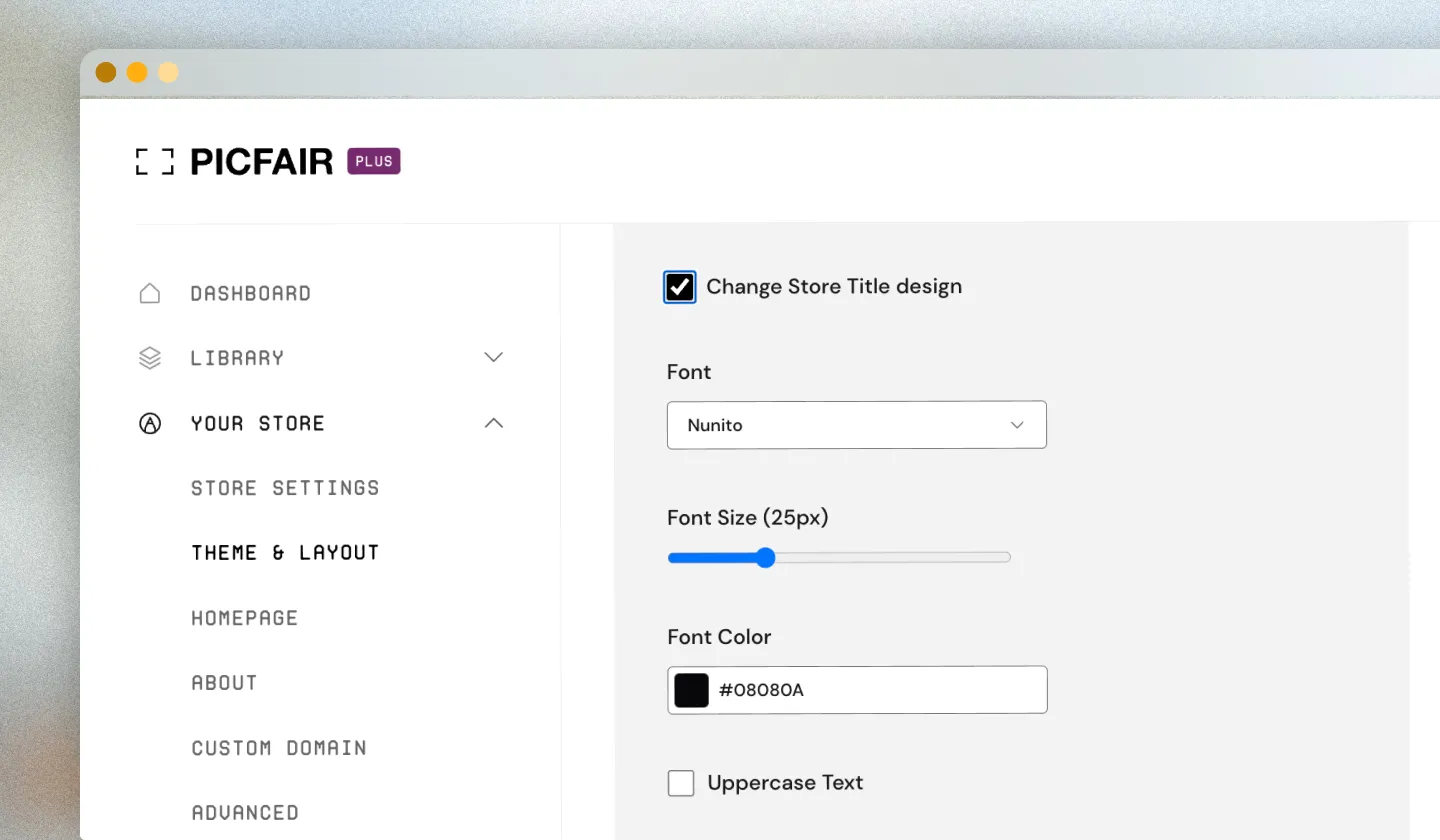
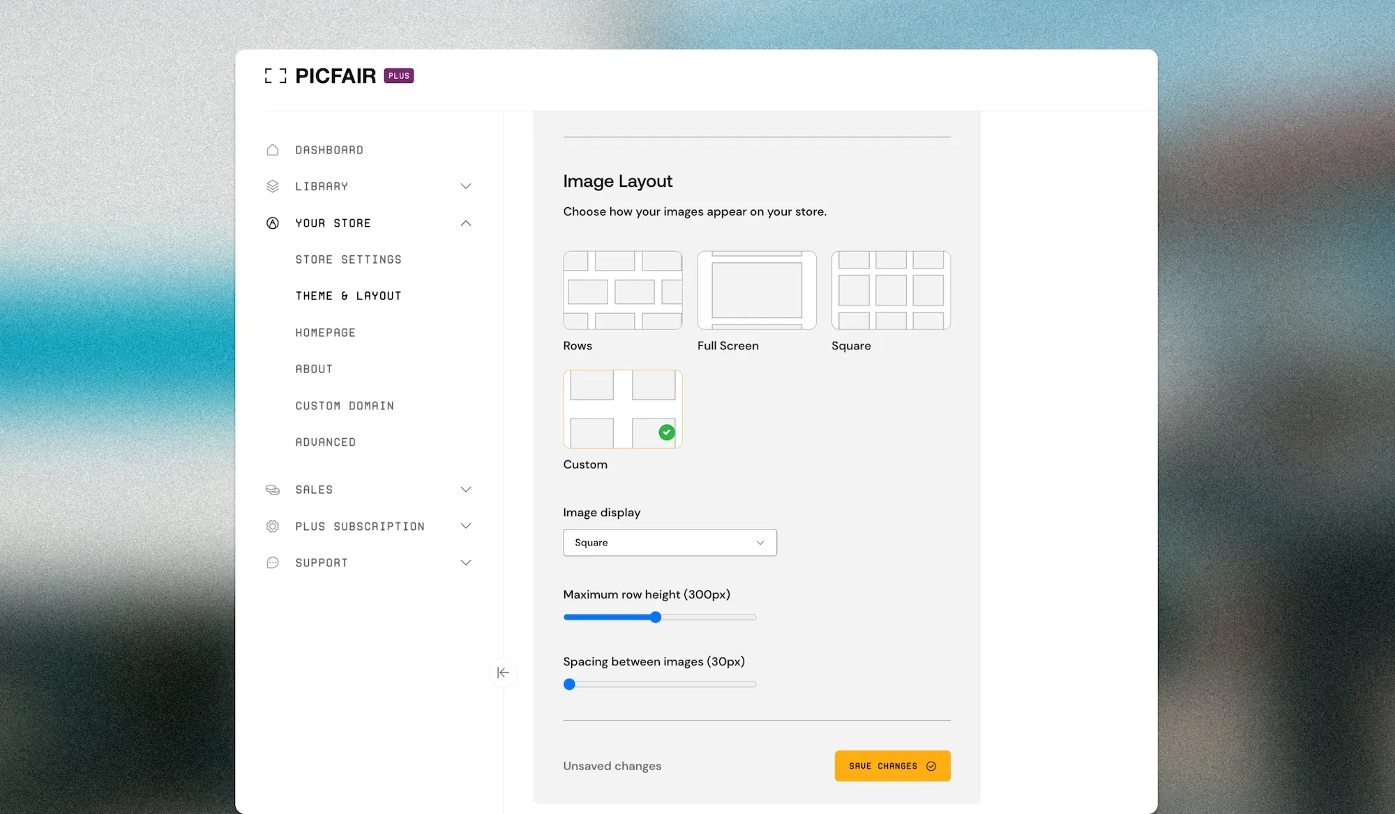
Remember that with any Picfair Theme, you can alter the font type, size, and colour for your Store name. You can select how you want your images displayed, whether that’s rows, squares, full screen, or a custom view, where you select any of those options but adjust the size and spacing between each image. All these settings can be configured from the Theme and Layout section of Store Settings.
Font customizations
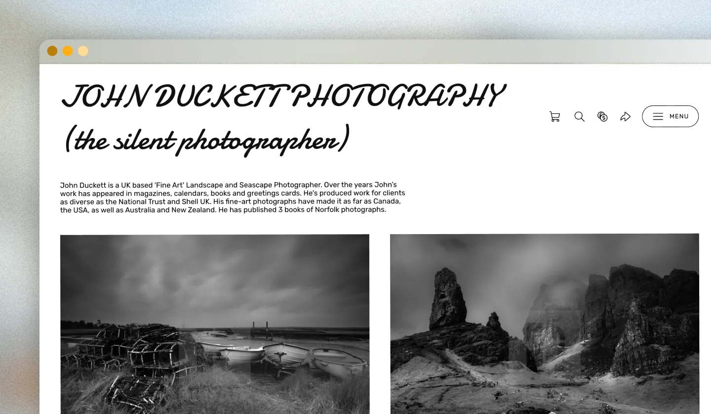
Photographer John Duckett (below) has chosen to change the font for his Store name from the Light Theme's default Nunito to Damion, and has increased the size to make it look more prominent.
We think it looks great and fits well with the black and white photography within his store.
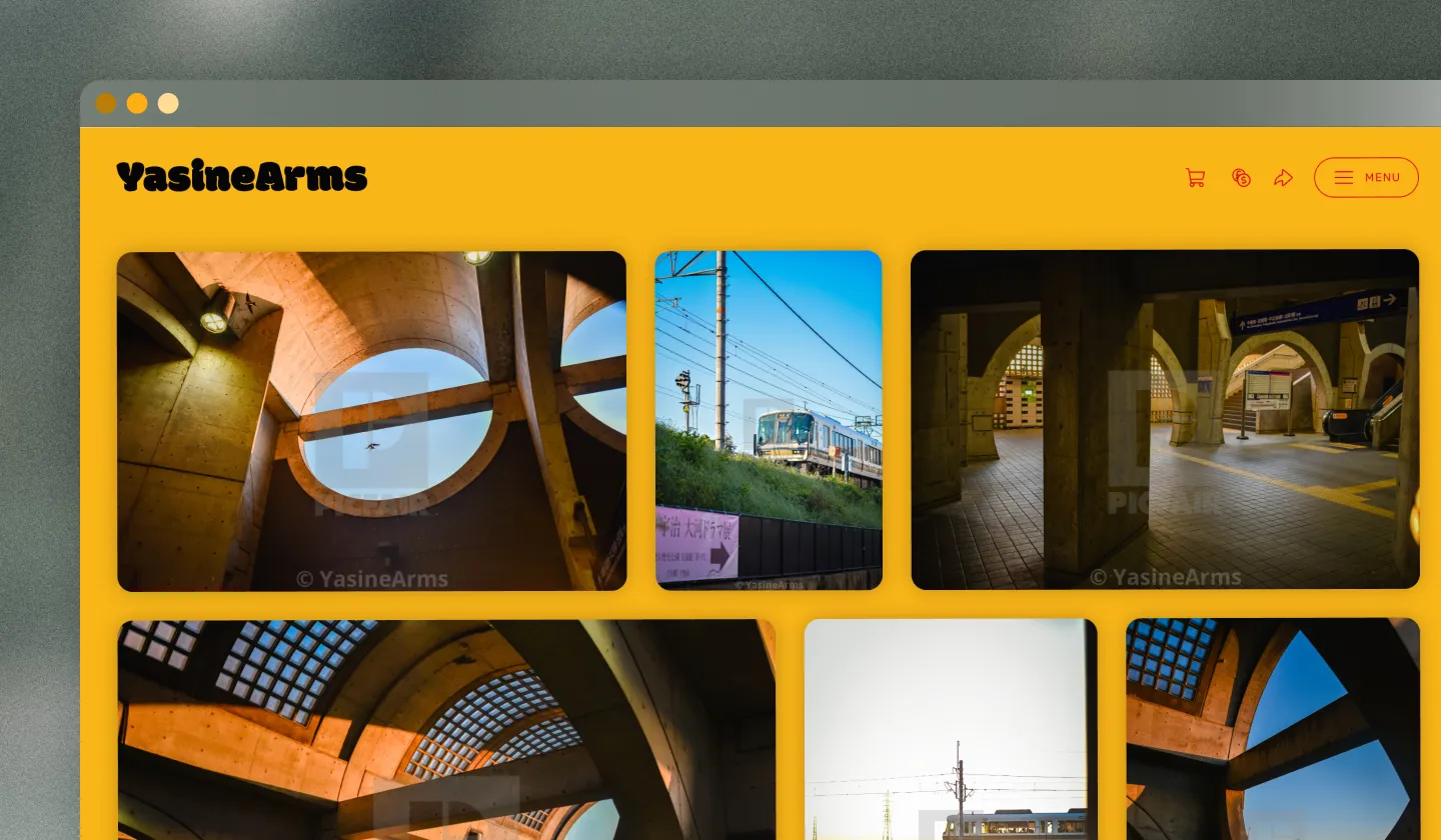
Photographer YasineArms has chosen to keep the default font, Modak, for the Retro Theme but has switched the colour from red to black, we think it looks really good with the image set!
All fonts can be customized from the Branding section of Theme and Layout on Store Settings and select 'Change Store Title Design'.
Custom image display settings
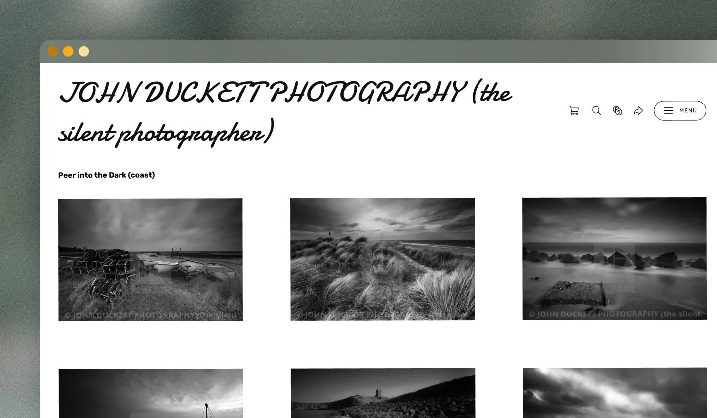
As well as using a bespoke font, John Duckett has also chosen to rearrange how his images are displayed, where he's given each one a good amount of space in between and a uniform layout of rows throughout–very nicely done!
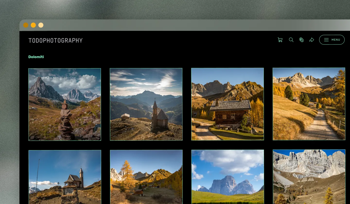
Photographer Todo Photography has not only chosen to change the colour of the font for his store title (Future Theme) but he's also chosen to display his images in the neatly-arranged square layout on his store. Looks great with the landscape shots!
All image display options can be configured regardless of whatever Theme you're using by going to the 'Image Layout' section of Theme and Layout under Your Store on your Picfair Dashboard.
Final thoughts
I hope the above examples gives you a good (yet simple) overview of how you can make small tweaks and alterations to add that extra level of customization to your Picfair Store, to make it all the more personal and stand out.
Remeber, you can configure all of these settings from the Theme and Layout section of your Your Store. Remember, it's always worth trying out different colours, fonts, and layouts to see what works best for you, experiment, and enjoy being creative in the process!


