


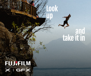
Black and white is a look universally-loved by photographers. Here's how to make the most of your black and white conversions with our top tips and simple editing tools
Any image can be desaturated, but the best black and white photos are those that seem designed for the aesthetic, and there has to be a reason for removing the colour. It needs to be more than just an effect you apply to your images in post-production.
It’s not always clear which images will work best in monochrome (black and white), but there are certain things you can look out for, and we'll explore some of the key aspects here:
1 The black and white aesthetic
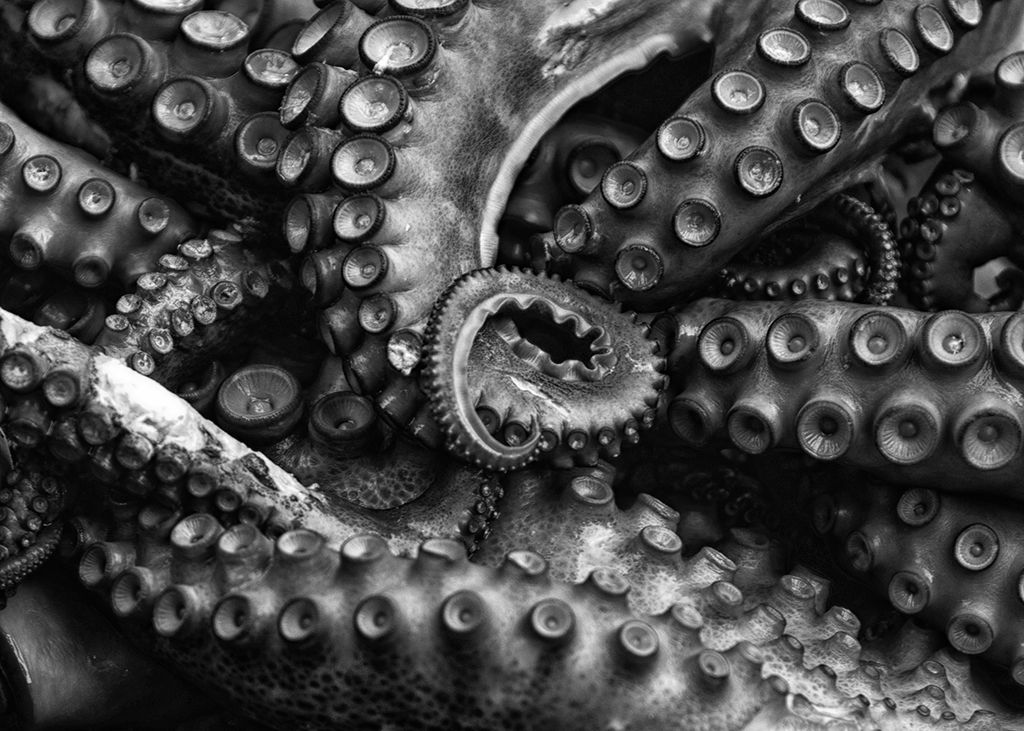
Some subjects and scenes lend themselves to a monochrome treatment more than others, like bold shapes, strong textures, or eye-catching patterns.
Of course, black and white photography also harks back to a time before colour, so it evokes a link to the past and gives images a timeless feel. This fits especially well with certain genres like documentary, reportage, portraiture and fine art photography.
2 Seek out contrast
Reducing a scene to shades of grey emphasises the play of light and the differences in contrast between the subject and its surroundings.
Without the colour, the viewer relies more on these differences in contrast to interpret the photo. We can use this to our advantage when searching for good subjects and scenes for our monochrome photography. Little pockets of light, or bold silhouettes, or strong bright shapes against a dim backdrop all work well in monochrome because they make the most of bold changes in contrast.
At a basic level, think about how to frame your subject so that they stand in contrast with their surroundings. Start to think of composition in a contrast-centric way and you’ll find scenes like this can be found almost everywhere.

3 Find the form
In photography, form relates to the play of light and shade across the subject, how the shadows and highlights give depth to your subject by accentuating the rise and fall, the ridges and the furrows.
Without colour, more emphasis falls on the form of the subject. The direction of the light is key. Side or backlighting can enhance the form, while frontal light might destroy the play of light and leave scenes looking flat.

4 Use exposure compensation
Our choice of exposure settings can lead to bold and beautiful black and white photography. When an image consists of shades of grey, it’s vital that those greys come out the way we intended.
For example, in a high-contrast scene you’ll get completely different results if you expose for the highlights or shadows. You can pick one or the other by dialling in exposure compensation for a lighter or darker scene.

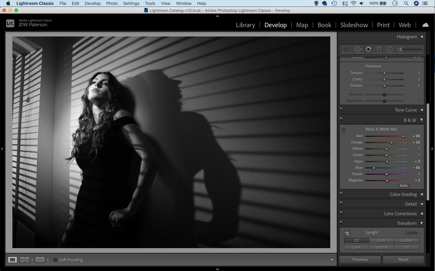
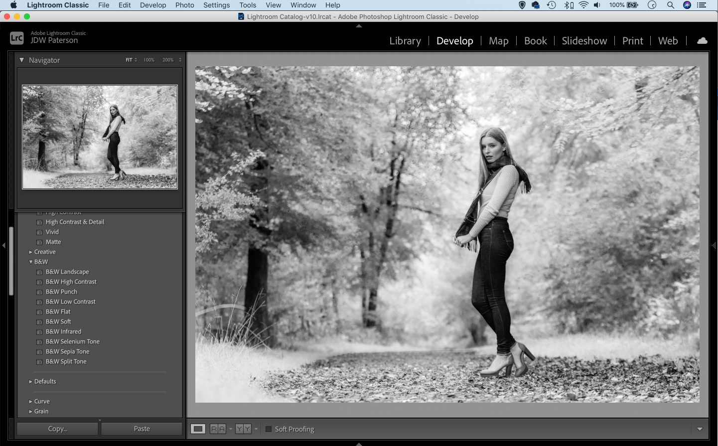
5 Use black and white for portraiture
It’s worth thinking about how the absence of colour might be of benefit to other aspects of the photo. Black and white portraits are a classic example. Removing the colour can allow you to emphasise other things, like the expression and character of the subject.
.jpg)
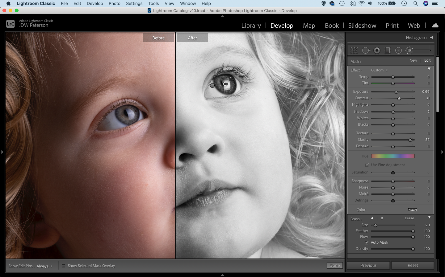
6 The best way to convert to mono
There are many ways to convert your image to monochrome, and the only ‘right’ way is the one that gives you the result you’re after.
If you want to take control of your conversion, the black and white tools in Lightroom and Photoshop are ideal. In Lightroom the B&W panel offers eight colour sliders. These let you fine-tune the brightness of individual colour ranges, so you get to decide how bright the blues in a sky, the greens in foliage or any other element should be in your conversion. You can either use the sliders to control colours (as seen in the screenshot below), or grab the target tool and drag up or down over parts of the image to change the brightness of the colours in that part of the frame.
7 Fix the flatness
Converting images to black and white can sometimes leave them looking slightly flat. It’s almost always a good idea to boost contrast, especially as monochrome images can often withstand more extreme contrast boosts than their colour counterparts.
As well as boosting contrast globally, you might also want to make local contrast changes by dodging and burning different parts of the scene to selectively lighten or darken them. Again, monochrome images will hold up to heavier dodging and burning than those in colour.
8 Use Lightroom presets
Lightroom offers an array of useful black and white presets that give you different monochrome looks with a single click.
Of course, you can also save any conversion settings of your own as a new preset to use on other images. What’s more, go online and you’ll find thousands of monochrome presets - some free, some paid - to download and try out on your photos. Sites like presetsheaven.com and presetlove.com are good places to start.
9 Mimic old film
Why not try and give your black and white images the look of a classic film stock? You can do this by adding grain in Lightroom to replicate the look of a high ISO film stock.
You can also download lots of ready-made presets that have been designed to mimic the look of certain stocks, right down to the grain size and toning. DxO FilmPack is an excellent resource of painstakingly faithful stocks, and you can find many excellent free filmic Lightroom presets online (try on1.com).
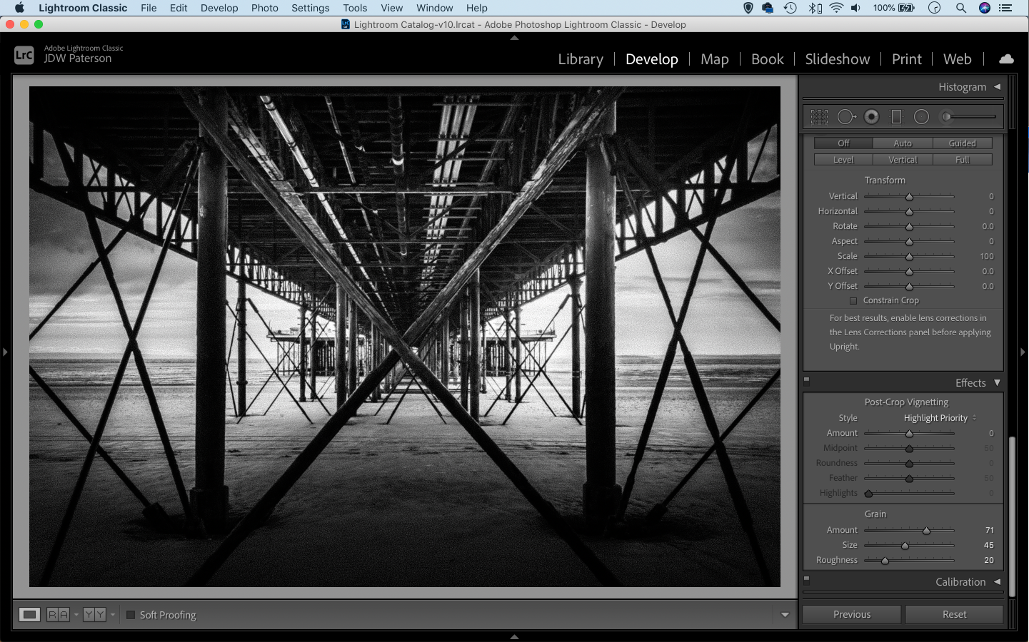
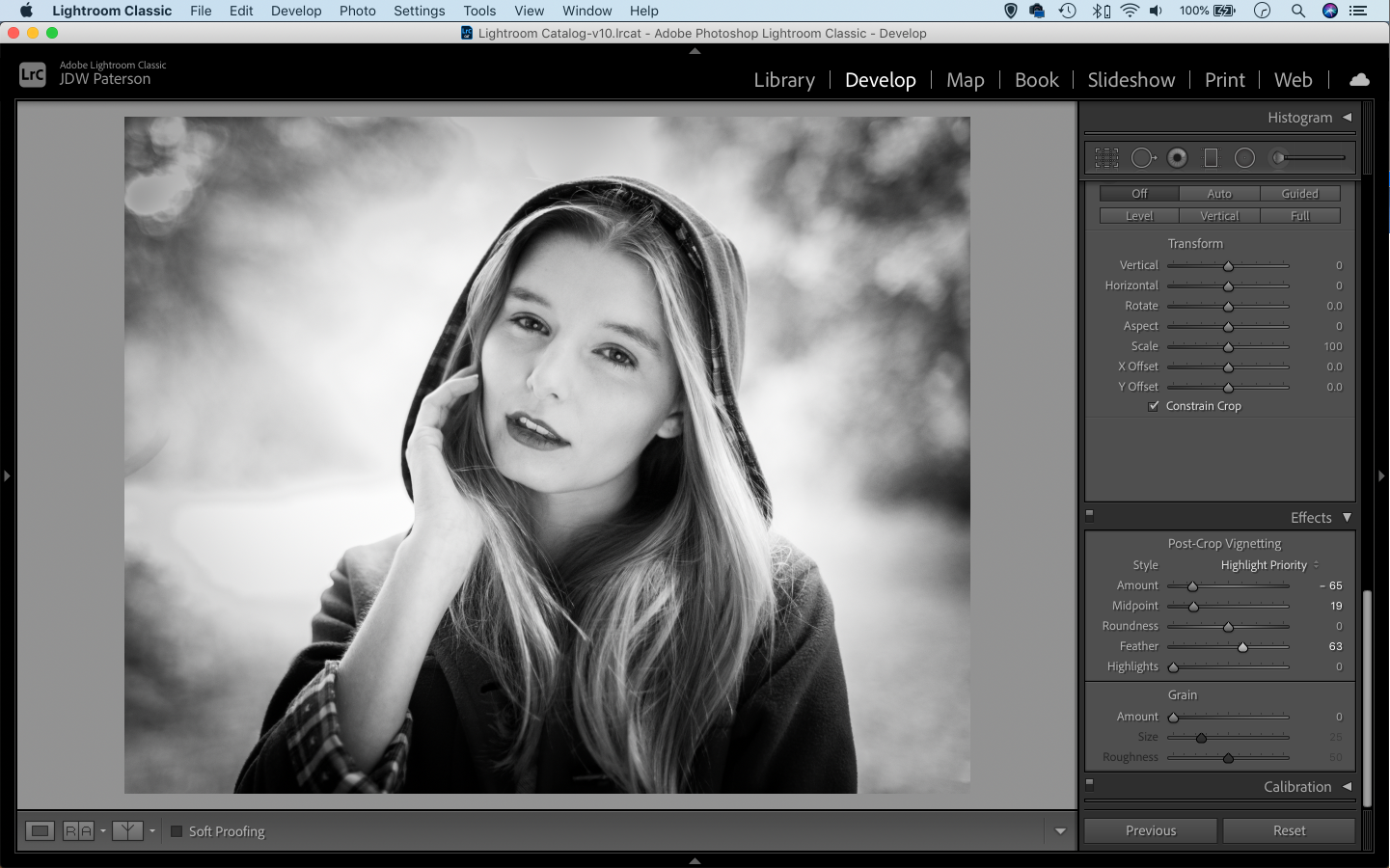
10 Add a vignette
There are certain edits that go hand in hand with black and white images, and one such trick is a heavy vignette.
A vignette simply darkens the corners of the frame. When we look at an image our eyes are drawn to the lighter areas first and away form the darker areas, so by darkening the corners we can draw the viewer’s eyes in towards the more important parts of the image.
Adding vignettes is easy in Lightroom -either use the Post-crop vignette tool or drag a circular edit with the Radial Filter and dial in negative exposure.
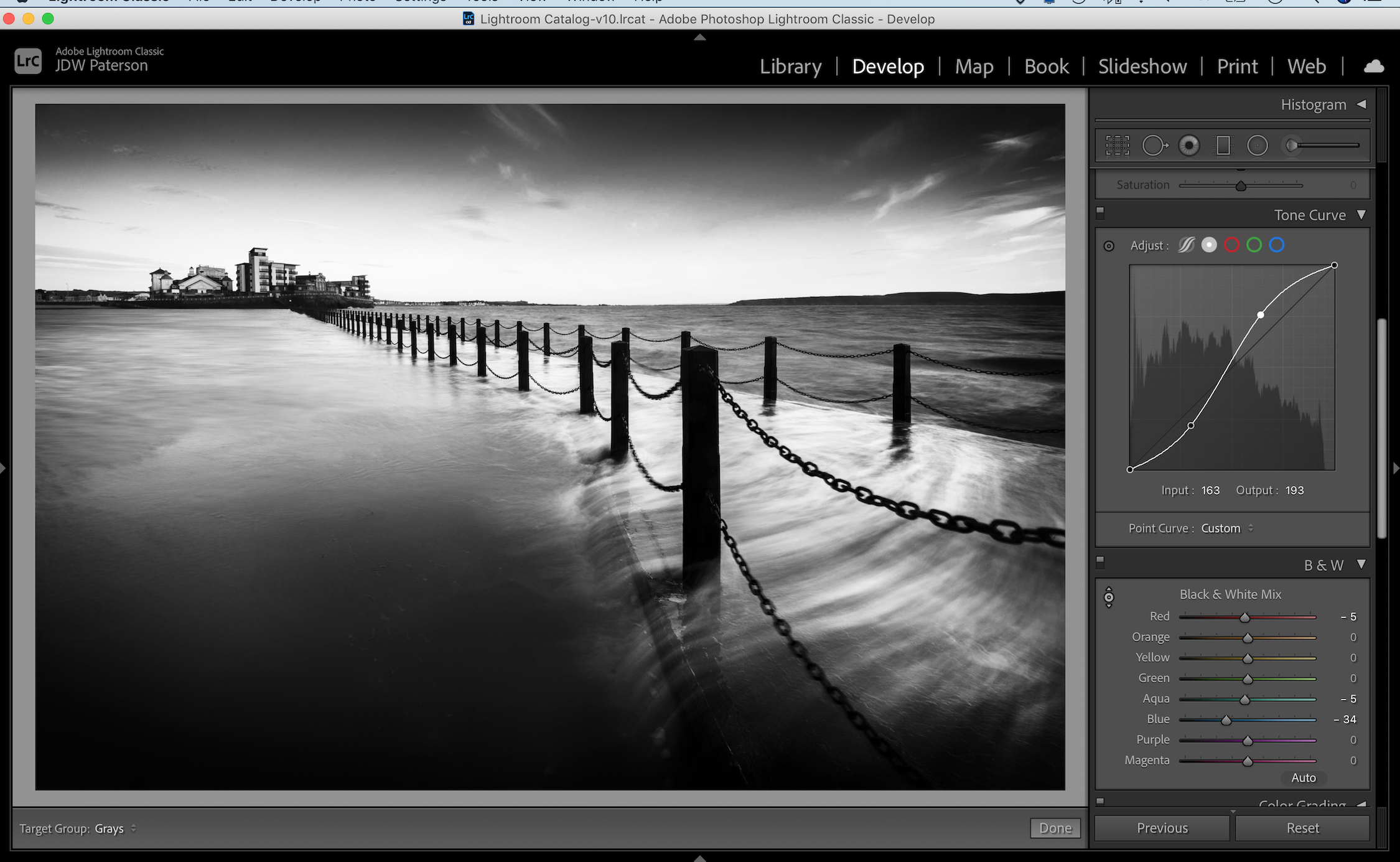
11 The power of the S-curve
One of the best tools for punchy black and whites is the Tone Curve in Lightroom (or similar curves tools in other editors).
The Curve line represents the tones in the image from black on the left side to white on the right. By dragging the line up or down we can lighten or darken specific parts of the tonal range. Even better, we can add two or more points to change the contrast.
A classic curves edit is the S-curve. We drag one point upwards near the top of the line to lift the highlight range, and a second point downwards near the bottom to darken the shadow range, thereby boosting contrast. The steeper the S-shape, the greater the change in contrast.
12 Quick B&W conversion in Photoshop
See the video below by James Abbott to see how you can get punchy black & white conversions in one minute using Photoshop's Gradient Map:
Find more video tutorials covering a range of post-production techniques on Focus here.
All images by James Paterson unless otherwise stated.

James has been a professional photographer and award-winning journalist for the past 15 years. He is editor of Practical Photoshop magazine and contributes to leading photography publications worldwide.
View all articles

