


Use our free film presets to get the look of legendary stocks, plus learn how to recreate the characteristic colours of each in Lightroom
NEW:
Discover (and download) all Picfair presets on our dedicated Presets page on Focus.
Sometimes the results from a digital camera can look a little cold and lifeless. Often what we’re after is a certain look, a feeling, an atmosphere to our photos. In the days of film, photographers would get this by choosing between different film stocks.
So here we look at how to recreate the characteristics of classic stocks like Kodak Tri-Max and Fuji Velvia. And if you’d rather skip the editing part, we’ve also supplied each as a preset for you to use in Lightroom and Photoshop’s Camera Raw. To use them, open Lightroom, go to the Preset Panel, click the plus icon at the top and choose Import Presets.
Film Presets:
Download your film presets here
1 The beauty of Fuji Velvia
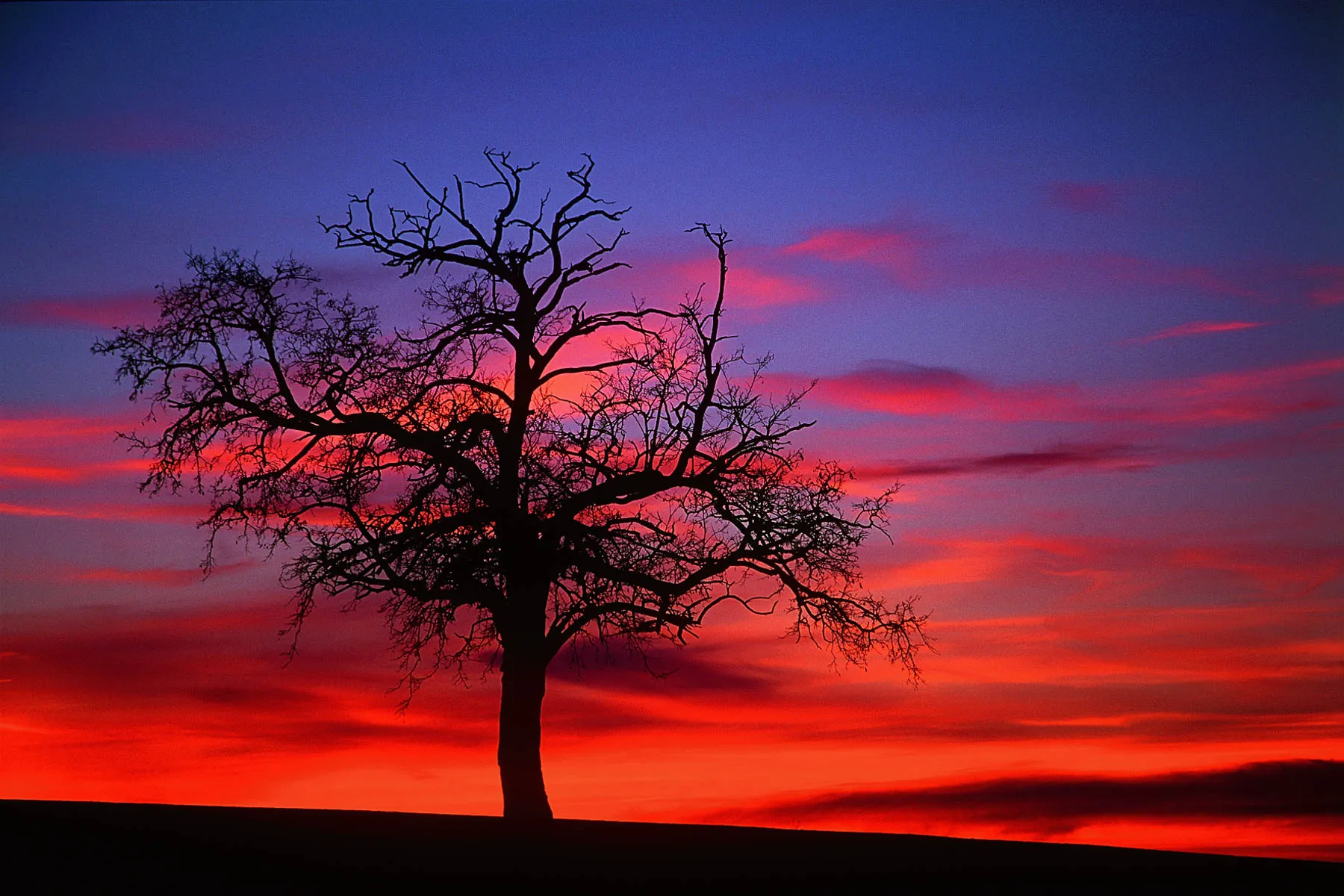
Still in use today, Fuji Velvia is a slide film that produces gorgeous, vibrant colours and deep contrast, with fine film grain and incredible sharpness. When this iconic slide film is projected, the colours have to be seen to be believed. In particular, it excels in bright sunlight, and enriches the warmth of sunrises and sunsets. As such, the film is cherished by landscape photographers for the bold richness of the images it lets them create. You’ll find a couple of Velvia presets amongst the download files for this article (one that applies a universal effect, and another that adds in a sky enhancement mask). Or you can create your own with ease…
2 Get the Fuji Velvia look
You can use the supplied Velvia presets, but - like all the film presets here- it helps if you can fine-tune the colours and tailor the effect to your image. Import any landscape image that displays blue skies and green foliage. After making basic tonal adjustments, head to the HSL/Color panel, click the Luminance tab and drag down over the blues to darken them, and up over the greens to lighten them. Next click the Saturation tab and drag up over blues, greens and any other colour ranges you want to boost.
3 Punch Tri-X
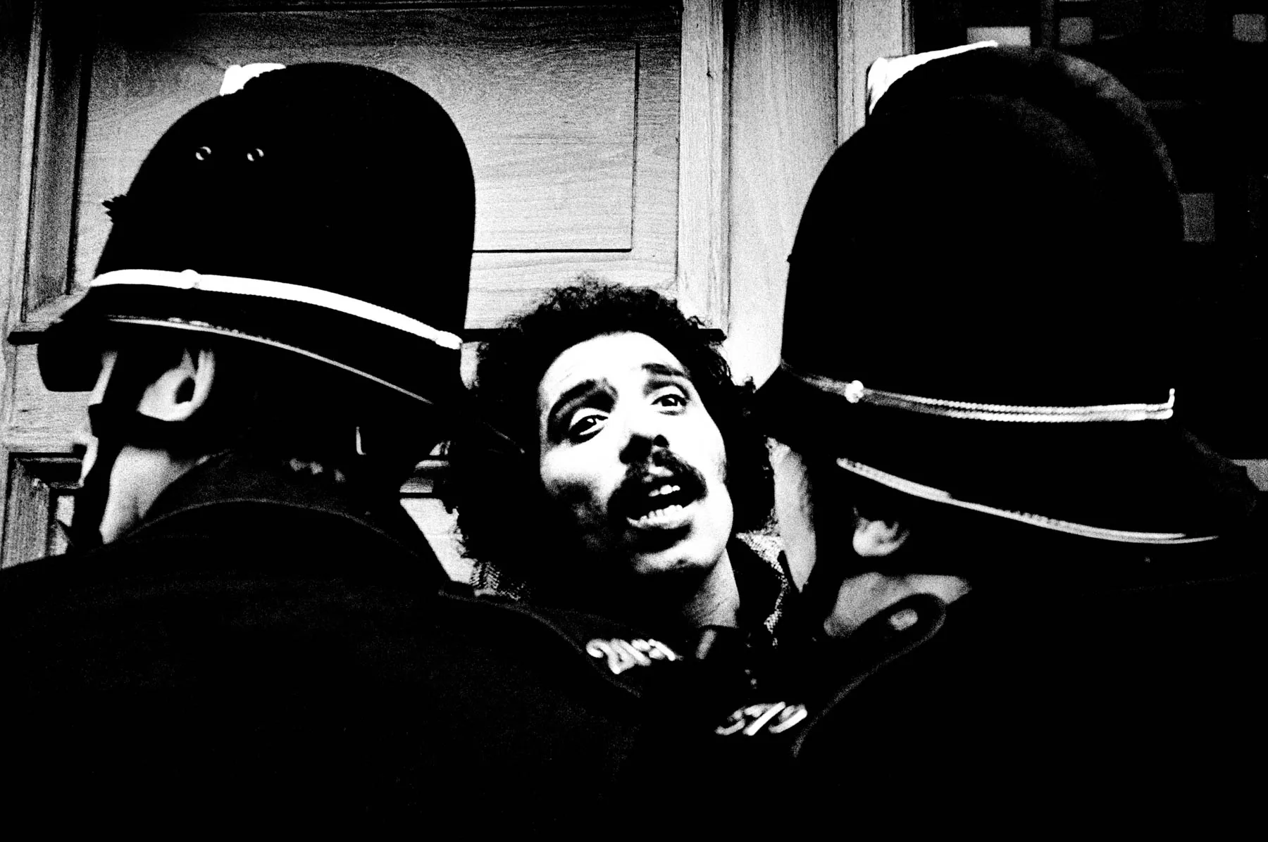
First produced in 1954, Kodak Tri-X has become perhaps the most famous of all film stocks. Beloved by portrait and documentary photographers for its characteristic grain and contrast, it could also be pushed to 1600 ISO You’’ll find two Tri-X presets, one recreating the classic 400 ISO stock, and one simulating it being pushed to 1600 ISO, which, as well as allowing for lower light, resulted in punchy contrast and grainy detail.
4 Get the Tri-X look
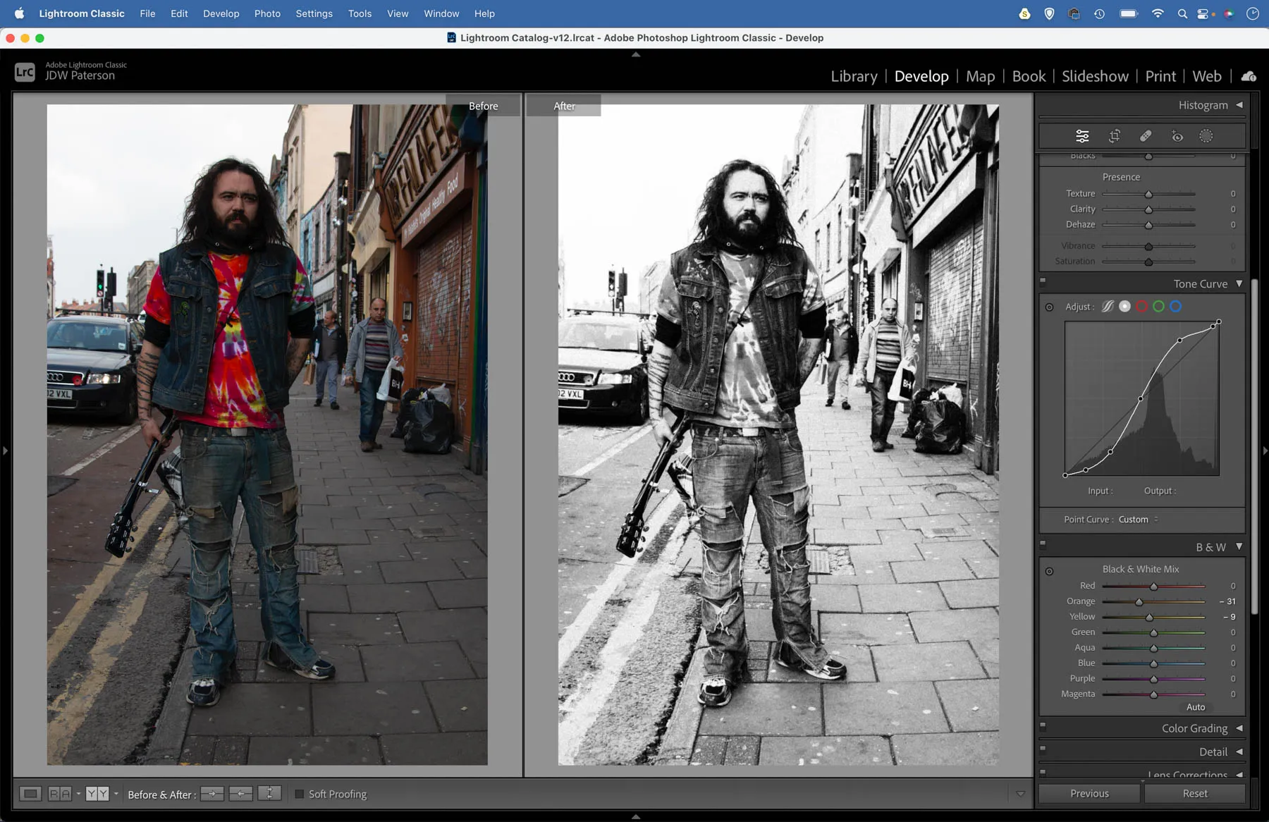
We can recreate the look of Kodak Tri-X 400 with a combination of black and white tools in Lightroom. First we set the Treatment to Black and White, then use the B&W panel to reduce oranges and yellows slightly, which can help to add depth to skin tones. Next we go to the Effects Panel where we find grain controls. Zoom in close and use the Amount, Size and Roughness sliders to tailor the look of the gain to your chosen image. Here we set Amount 65, Size 26, Roughness 45.
5 The richness of Kodachrome 64
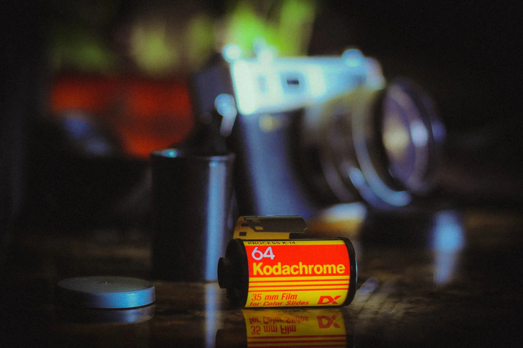
This film stock has unparalleled pedigree. Steve McCurry used it to capture the famous photo of the green-eyed Afghan girl, Paul Simon wrote a song about it in 1973, and there’s even a recent Netflix film starring Ed Harris that bears its name. Kodachrome 64 produces a richness and depth to colours that was hard to match, and the very fine grain was ideal for rendering details.
6 Recreate Kodachrome in Lightroom
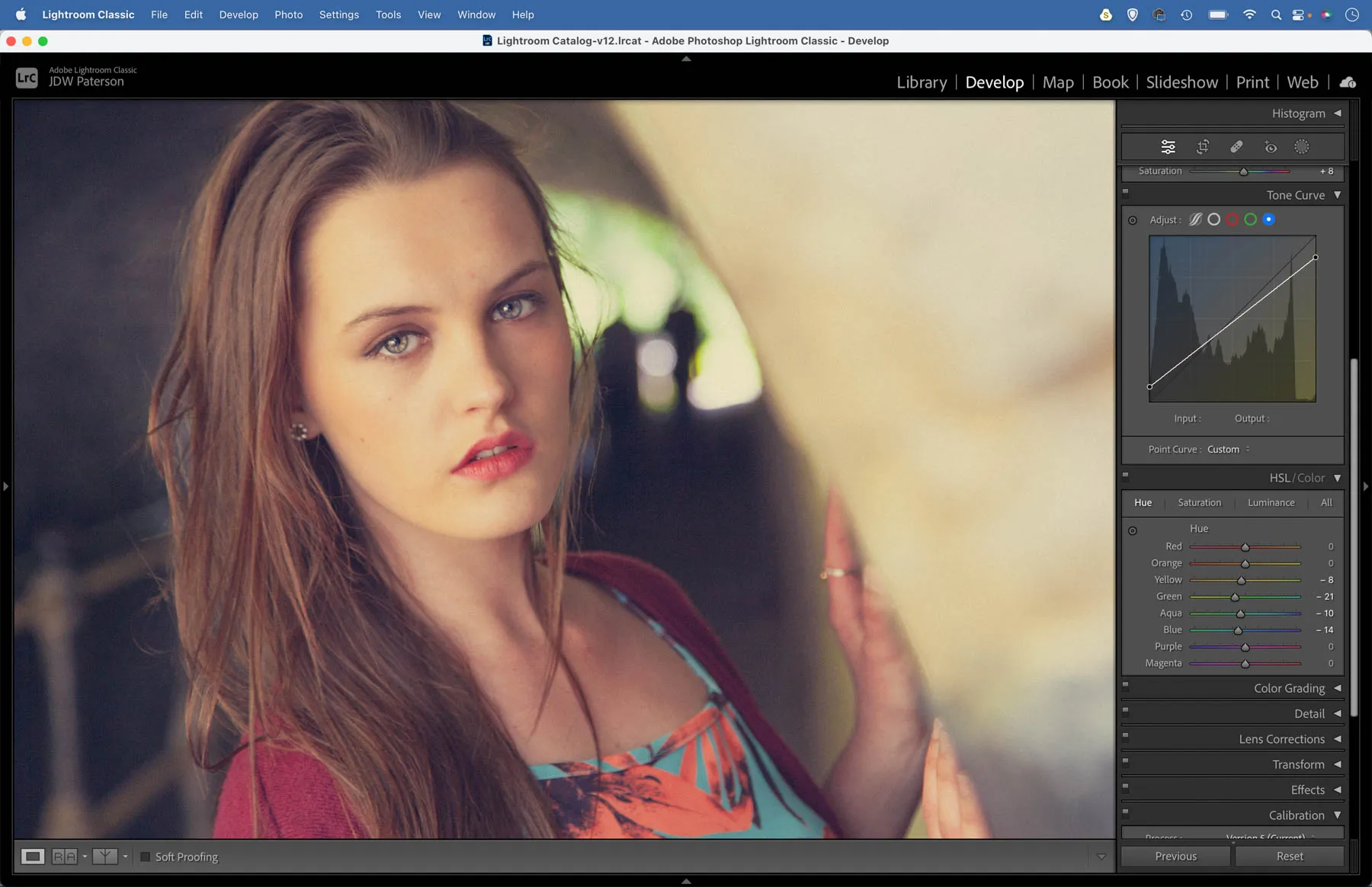
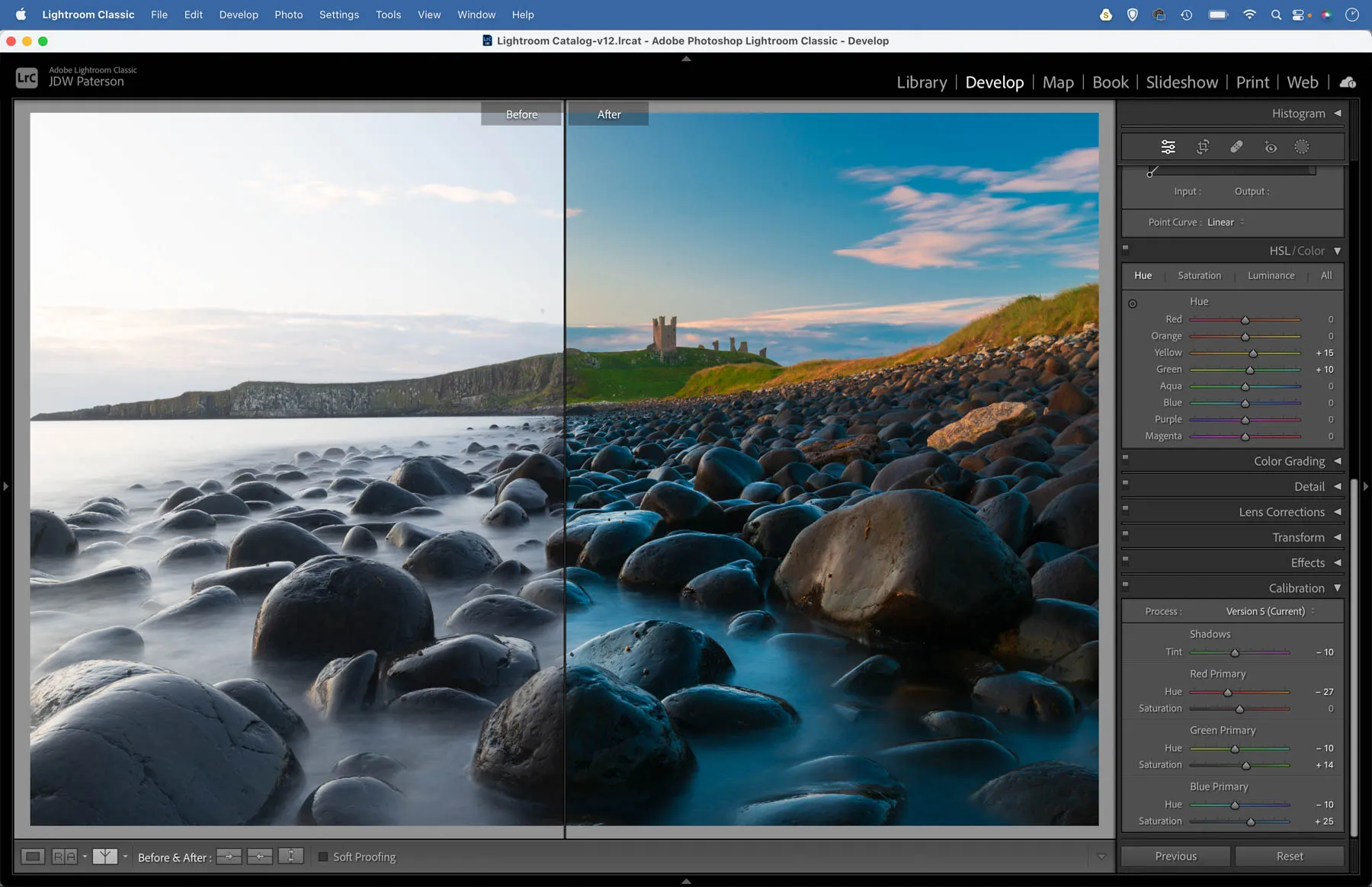
Kodachrome is renowned for the richness of colours, especially vibrant in the reds and magentas. To get the look in Lightroom, begin by boosting contrast then head to the HSL Panel. Increase the Reds saturation and decrease Blues slightly, then go to the Hue tab and drag blues to the left slightly to tint them more towards cyan. Next head to the Calibration panel and drag the shadows slider towards Magenta.
7 Cross Processed slide film
Cross-processing is a chemical technique in which film is intentionally processed in the wrong chemicals. Typically, E-6 slide film would be treated as if it were a negative film. The results were skewed colours, with highlights - and blue colours in particular - shifting more towards green, and shadows towards magenta. You’ll find two cross-process presets, one that gives a strong blue cast reminiscent of Fuji Superia, the other a green cast similar to Kodak Elite Chrome.
8 Get the cross-processed look
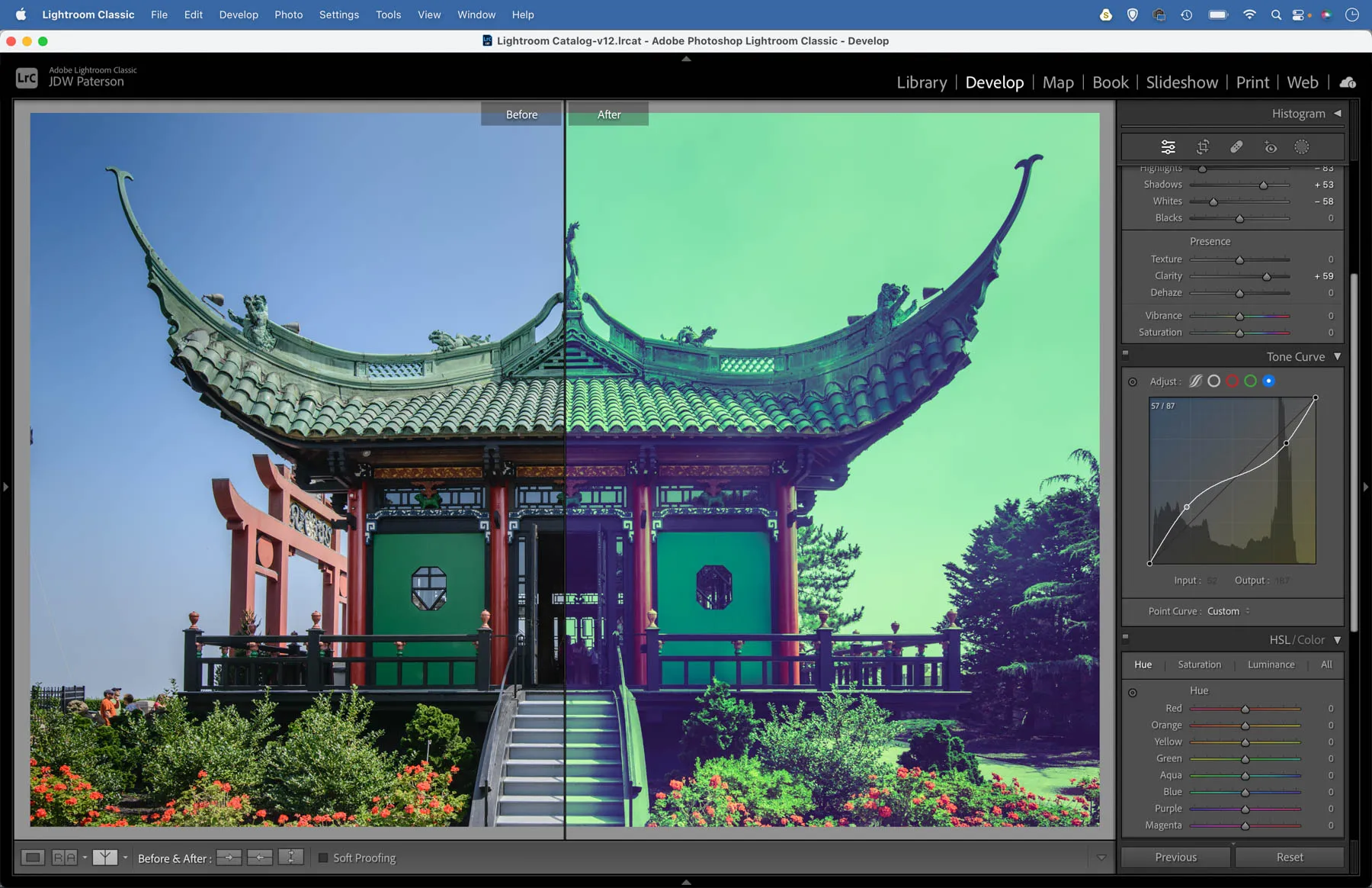
We can replicate the cross process look in Lightroom or Photoshop with a Curves adjustment. Curves not only lets us change brightness and fine-tune contrast, but also allows us to skew colours. This makes it ideal for introducing the sort of colour shifts we would see when cross processing slide film, which often resulted in a strong blue/cyan shift. Go to the Curves panel in Lightroom, then click the RGB dropdown and choose Green. Plot an S-shaped curve line as shown to introduce green into the highlights and magenta into the shadows. Next target the Blue channel and make an inverted S-shape as shown to tint highlights yellow and shadows blue. Finally go back to the RGB composite channel, lift the bottom left shadow point to fade the shadows and fine-tune the brightness as shown.
9 Beautiful portraits with Kodak Portra 400
This versatile negative is still one of the most popular films in use today. The colours are fairly neutral, the grain is fine, and the tones are particularly suited to skin, which makes it a popular choice for portraits, as well as travel and weddings. You’ll find a Portra preset to try out, plus another that also applies subtle enhancements to the skin and eyes.
10 Tint your photos like Portra
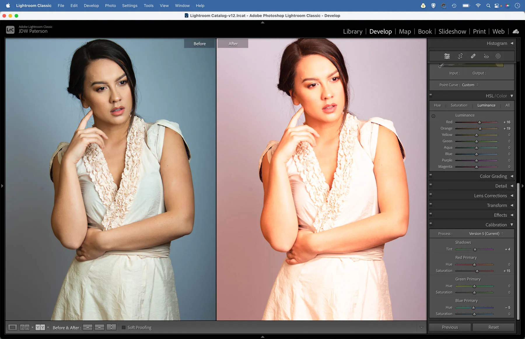
To recreate the Kodak Portra look, try increasing the contrast slightly by making an S-shape curve line. Next go to the HSL panel, increase the Luminance and Saturation of the red and orange channels. Finally, go to the Color Grading panel and shift the midtones ever-so-slightly towards red.
Film Presets:
Download your film presets here

James has been a professional photographer and award-winning journalist for the past 15 years. He is editor of Practical Photoshop magazine and contributes to leading photography publications worldwide.
View all articles

