


If you’ve ever wondered how to give your photography a mood or just want to learn something that will make your photos stand out from a crowd, then split-toning is for you.
Split toning is used by photographers around the world to achieve stylized images. You’ve undoubtedly seen the split-tone effect, even if you weren’t aware - either in VSCO filters or the work of famous Instagrammers, or even in Hollywood blockbusters.
In this article, we’re going to share with you everything you need to know about split toning to create beautiful, one-of-a-kind images.
So if you’re ready to take your images to the next level...then let’s get started.
What is split toning?
First things first: What actually is split toning?
While split toning may sound like a complex technique, it’s really not. It simply refers to pushing one color into the shadows of your images, and a different color into the highlights of your images.
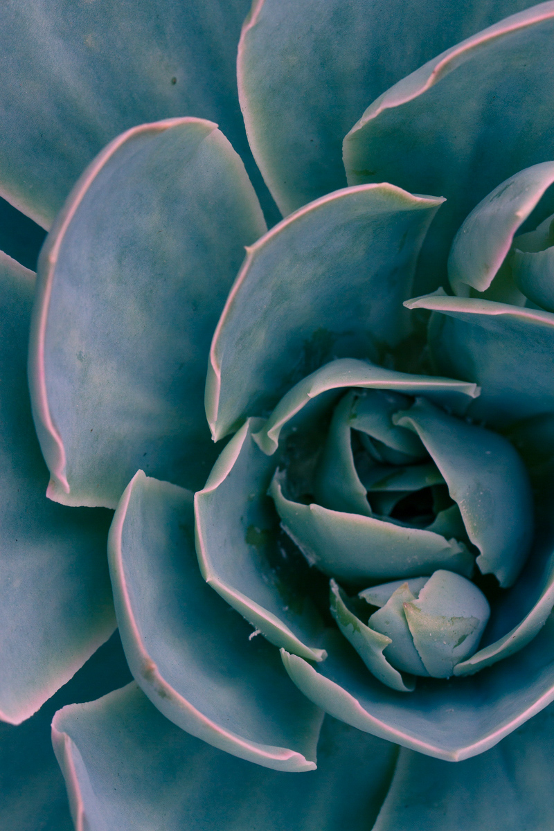
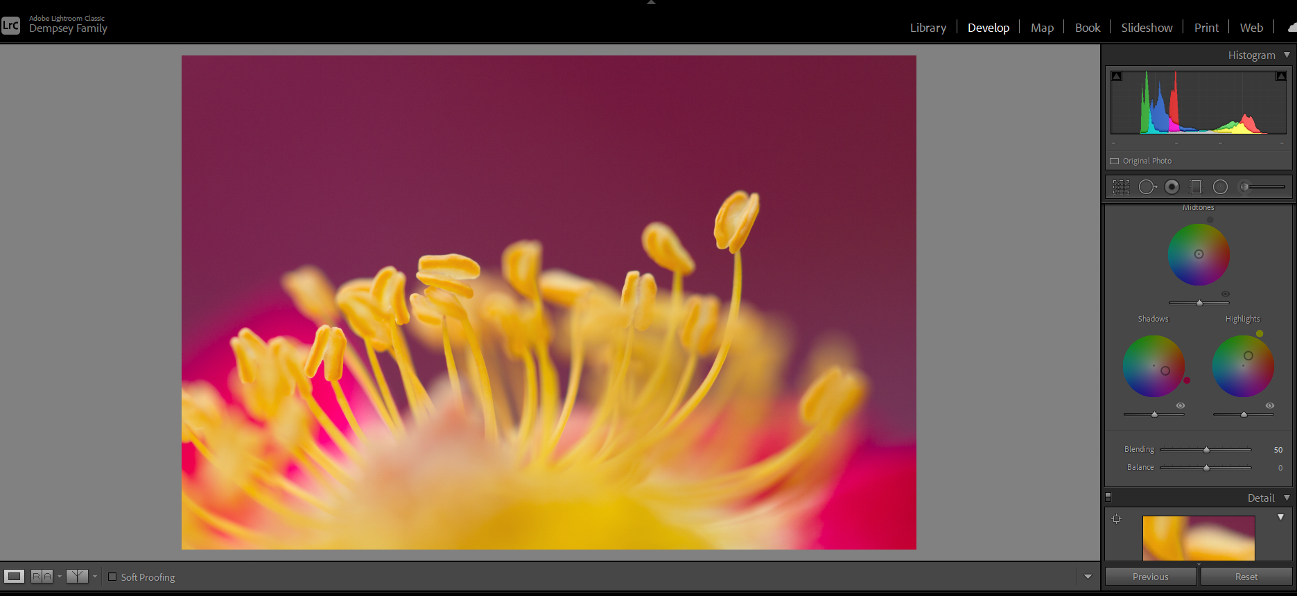
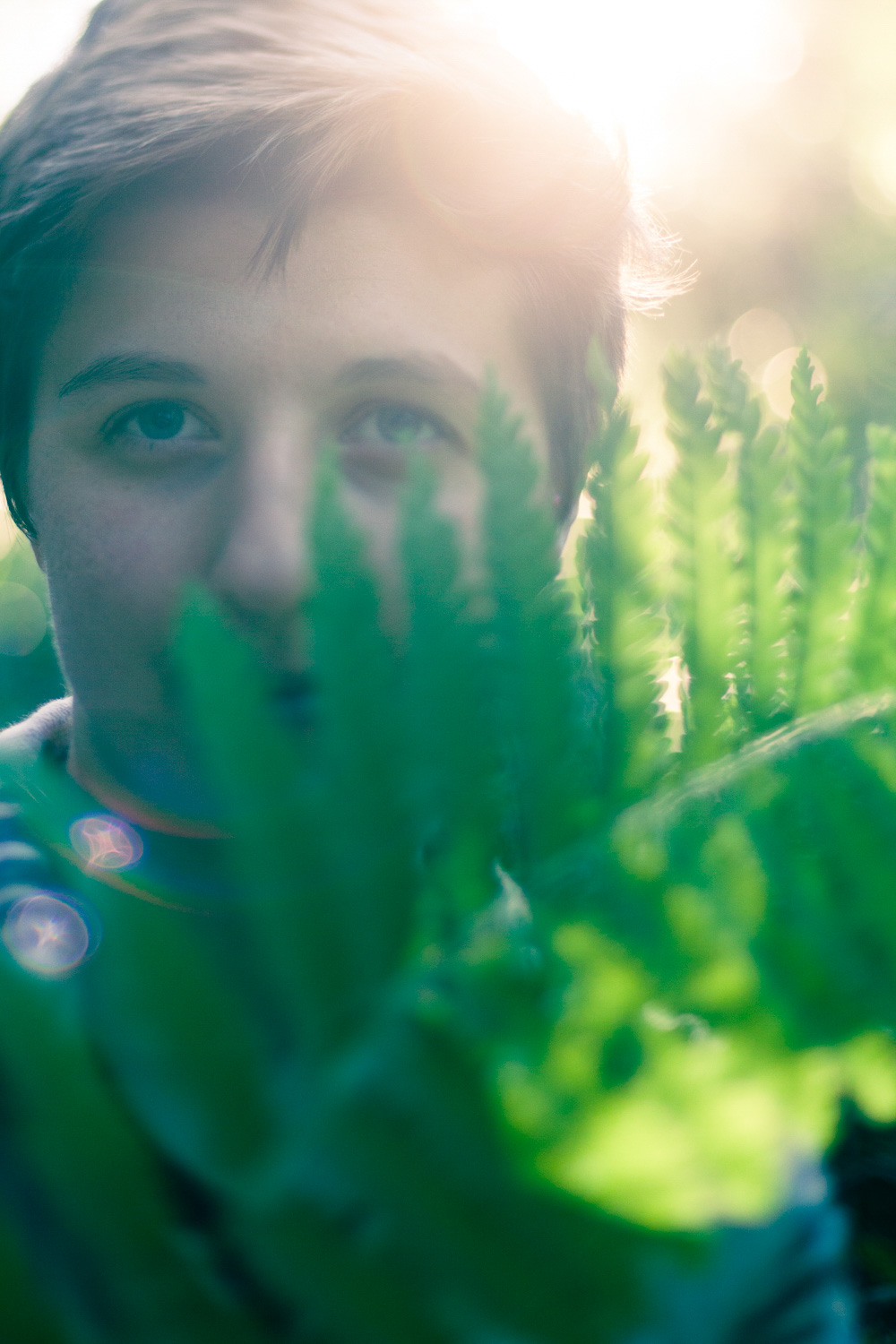
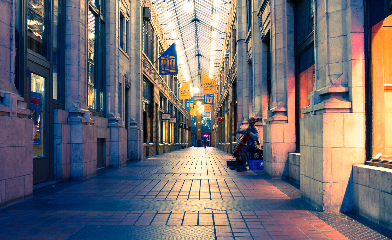
This can result in all sorts of cool effects, like this:

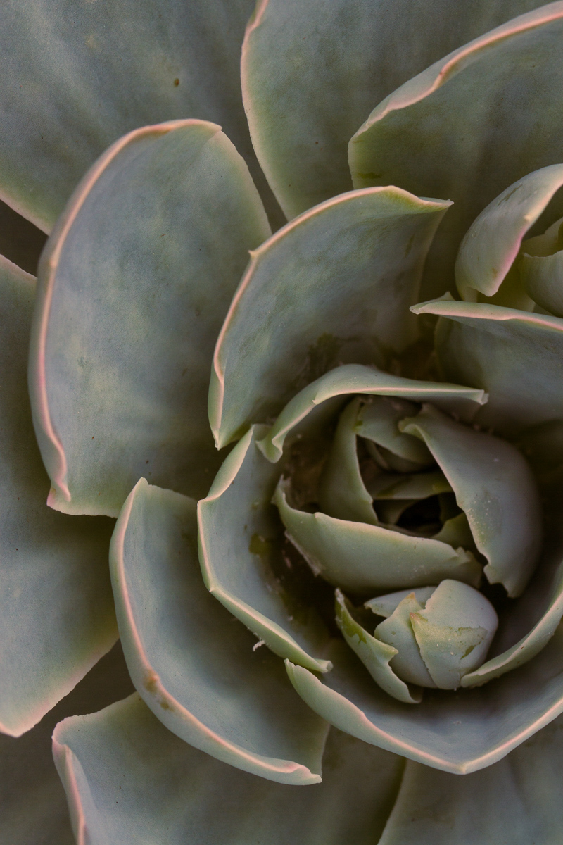
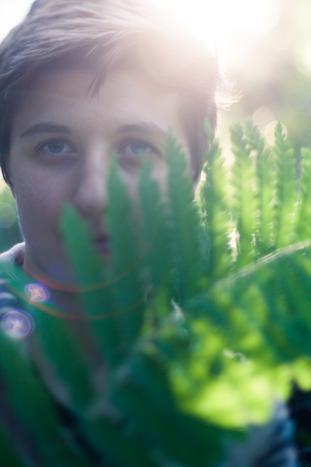
Here’s the image prior to split toning:

In fact, while split toning is a great way to give your photos a unique look, its effects aren’t generally repetitive or cliched.
Split toning is popular, yes, but it’s always possible to use split toning effects in new and interesting ways - which means that split toning can often act as that extra spark, that little bit of magic that makes your images different from all the other photographers out there.
But what makes split toning special? And why, specifically, should you consider using it in your images?
Why is split toning so useful?
Split toning is a great tool for three big reasons.
First, as we emphasized above, split toning is a great way to give your images a unique look or style. So by applying the same split tone combination to a series of images, you can make them instantly recognizable as your shots.
Second, split toning allows you to introduce different moods into your images via carefully-chosen colors.
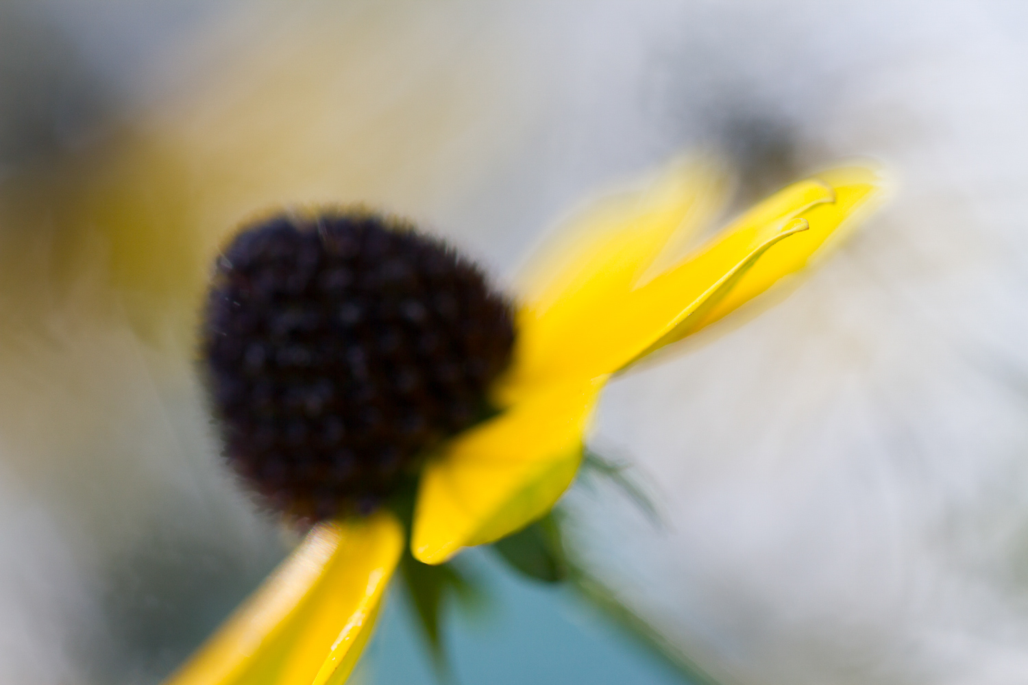
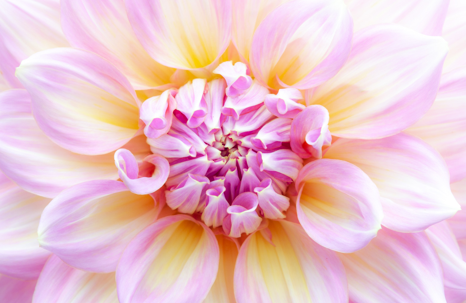
For instance, if you add blue into the shadows of an image and purples into the highlights, you’ll get an image that feels very moody and cold:
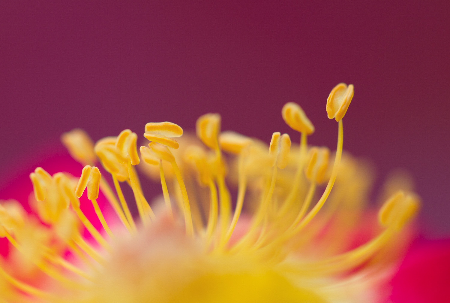
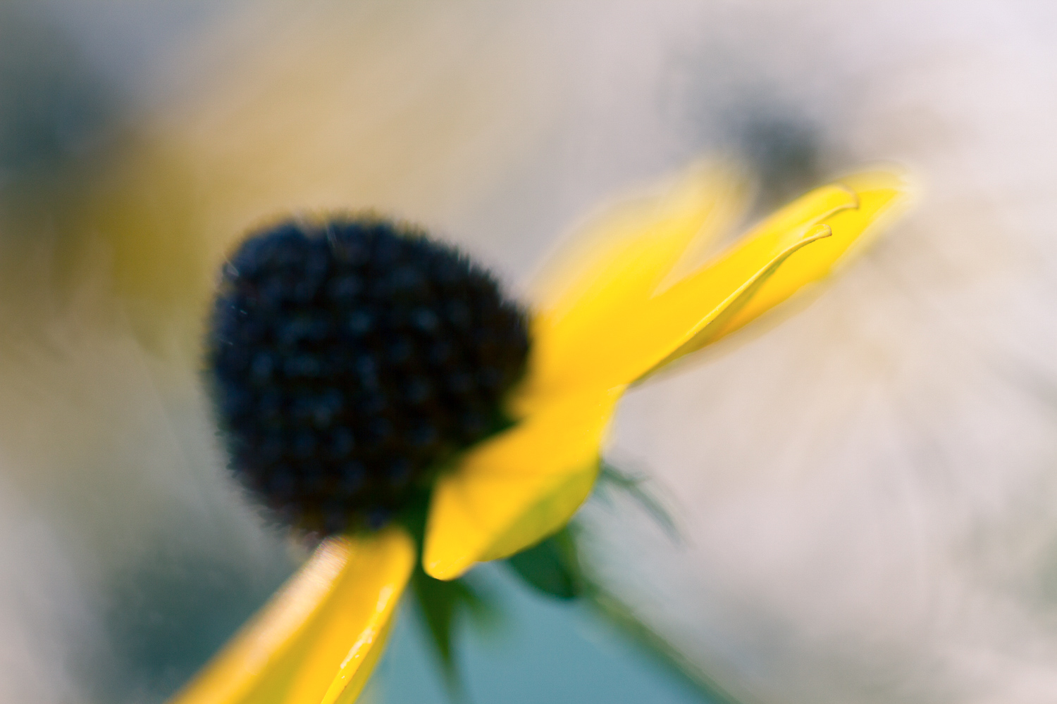
Whereas if you add oranges into the shadows and yellows into the highlights, you’ll end up with a different shot entirely:
(Of course, these color effects aren’t completely reproducible; you won’t always get the same look from a warmer or colder split tone, because different tones and subject matter work together with the split tone to create the final effect.)
Here’s the bottom line: Color is a great way to influence mood. And so by carefully choosing colors while split toning, you can create a more focused, effective image.
Third, split toning can create (or reduce) contrast in a scene. By using contrasting split tone colors, you can add contrast into your images. And by using similar split tone colors, you can de-emphasize contrast, so that the image feels more united overall. This all has to do with color theory, as we discuss in the next section.
How to decide on your split tone colors: use color theory
Color theory is the bedrock of split toning. When you head into a post-processing program to start split toning, you’re not going to want to pick colors blindly. Instead, you’ll want to have an idea of how you can create great results. That begins with basic color theory.
Now, color theory uses a simple color wheel. Colors next to one another on the color wheel are called analogous, because they’re similar to one another and tend to give a similar feeling. So red, orange, and yellow are analogous colors, all offering an overall warm mood.
Colors across from one another are called complementary, or contrasting, because they stand out when placed together. Think of red and green, purple and yellow, or turquoise and orange. When you see green and red together, all strong and bright, it can be difficult to look at; that’s the power of complementary colors.
Now, when you start to split tone your images, think of the color wheel (You can look at one online, if you like, or you can simply use a program that has color wheels built in, such as Lightroom).
Ask yourself: What do I want to achieve with this image? Do I want a powerful image that pops off the page? Or am I looking to create a piece that looks much more subtle?
If your goal is to create a strong, in-your-face image, then complementary colors are probably the better option. Here’s an example of a complementary split tone:

Whereas if your goal is to keep things more restrained, analogous colors are a great choice. Here’s an example of analogous split toning:
Now that you’re familiar with the split toning basics, let’s take a look at how you can actually create split tone effects in post-processing programs...
The best post-processing programs for split toning
If you’re new to post-processing, you may be wondering: What editing programs actually allow me to split tone? The truth is that almost all the popular programs allow for split toning, even if they don’t call it that.
Luminar offers a split toning tool. Photoshop allows you to split tone with a color balance adjustment (and a number of other tools, too!). Capture One offers a set of highly-useful color wheels. And Lightroom used to offer a Split Toning panel, though the name has been changed to Color Grading in a recent update. Ultimately, any of these programs will do just fine for split toning.
But in this article, we’re going to focus on split toning in Lightroom Classic.
How to easily split tone your photos in Lightroom Classic
Fortunately, split toning your images in Lightroom Classic is amazingly easy. Simply select your image and head over to the Develop module. Then scroll down on the right-hand side until you find the Color Grading panel:
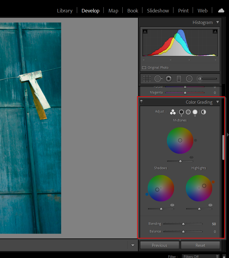
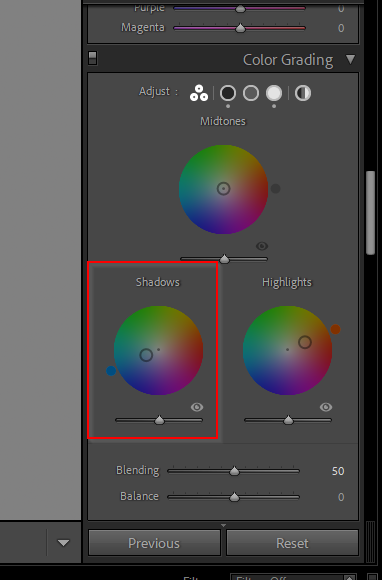
Select the Shadows color wheel, and manipulate the circle in the middle until it gives you the hue and saturation you’re after.
Then select the Highlights color wheel, and do the same:
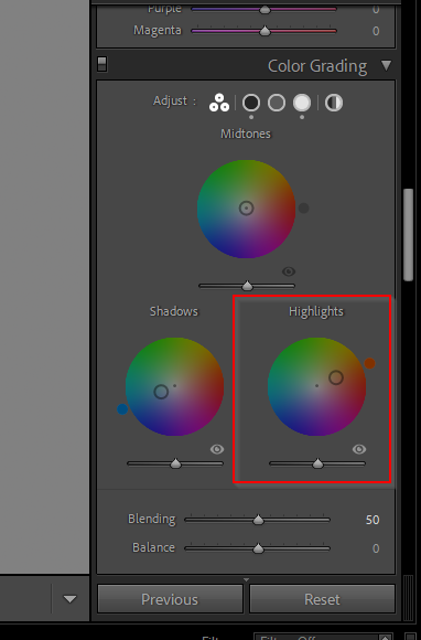
Note that you choose the hue (in other words, the color) of the split tone color by positioning the circle somewhere within the wheel. And you choose the saturation (in other words, the intensity) by positioning the circle somewhere from the center of the wheel on out, where the closer the circle is toward the edge of the wheel, the stronger the split tone intensity.
Also note that Lightroom does also allow you to tone the midtones of your image. It’s often a good idea to pick a color that closely mirrors your highlights color (or you can avoid picking a midtones color completely). Our favorite method for split toning is simply selecting different points on the color wheels--often at a very high saturation--to see how the split tone looks. If we find something we like, then we dial it back for the final image. Make sense?
Tips for applying split tone effects
Here are some of the best ways to use split toning for a gorgeous result:
- Keep split toning to a minimum with natural subjects
Split toning is great. And it often works really, really well on portraits. In fact, when you’re split toning portraits, you can really boost the saturation, as long as you don’t mess with your subject’s skin tones too much. That’s why it often makes sense to use a warm color in the highlights when editing portraits - skin tones are warm, and therefore the highlights don’t skew them too much.
Here’s an example:
And here’s the image before split toning, by the way:
Despite the success of split toning... You have to be a lot more restrained when applying split toning to nature images. It’s not that you should never split tone landscape, macro, or bird photos. But you want to keep the effect very, very subtle.
Why? For one, we’re generally not used to seeing ultra-stylized nature shots, especially in movies and TV. Plus, strongly split-toned nature shots just aren’t very popular these days. So your viewers may react in surprise or shock.
Here’s what we recommend: Don’t be afraid to split tone nature images, but keep your split tone as restrained as possible. Don’t go too heavy on the saturation. And keep the tones somewhat reasonable, so that your skies look relatively normal and your trees don’t look a weird toxic green. Make sense?
Here’s a nature image before split toning:
And here’s the same image with some very subtle split tone adjustments:
- Don’t be afraid to experiment with colors (though blue and orange or blue and yellow are a good starting point)
If you’re just getting started with split toning, you might feel a bit overwhelmed. You may be struggling to decide what colors to choose. You may feel like you just don’t understand how you should go about picking the perfect color pair... Well, in truth, split toning really is all about experimentation. Sometimes, you just have to drag the split toning tool around, carefully watching your image until you see an effect that you like.
That said, if you’re looking for a quick way to start with split toning, try yellow or orange highlights and blue shadows.
Like this:
This is a famous split tone pair, because you’ll find them all over the place in photography and cinematography. And the color pair looks consistently good.
Additional tip:
A fun modification is orange and green, which is very popular in Hollywood and can give you a very interesting result...
- Work with the colors you already have
Here’s something many photographers don’t realize about split toning: It often works best when you steer into the skid. In other words: Take note of the colors that already exist in your image. And apply split tone effects that simply accentuate, or enhance, those existing colors.
For instance, if you’re working with a forest photo, you can often use a nice yellow color for the highlights, which will accentuate the warmth of the sun. And you can often use a rich green color for the shadows, which will keep the trees looking beautiful.
And for the photo below, orange and blue was used to split tone, which matched the letters and the background:

This works because it helps make already good-looking colors seem even stronger. But it’s also useful because of how it helps emphasize the two most prominent colors already in the image. This, in turn, makes the image simpler... and in photography, simple is almost always best!
- Keep the split tone strength low for subtlety
Split toning is very powerful and it can look amazing, but it’s also easy to overuse it. Instead of beautiful, artistically-toned color grades, you can easily end up with ridiculous, obviously-fake colors that nobody likes.
Like this:

That’s where restraint becomes important. So instead of split toning your image and then calling it a day, step away. Do something else for a few minutes. And then come back to your monitor and see what you think.
By the way, don’t be afraid to keep your split toning so subtle you can hardly notice it. This is what plenty of the best photographers do. Because instead of relying entirely on split toning to carry their images, they use split toning with a whole host of other adjustments. That way, their images look slightly better thanks to split toning. And they look amazing overall.
- Apply the same colors to a series of images
Here’s a final split toning tip that can be very helpful for anyone uploading images to image sharing sites, or to a website portfolio: Use the same split tone on multiple images (especially if those images are of similar subjects). This will allow you to create a unique style that is then repeatedly associated with you. And viewers will start to remember your work far better.
For instance, you might use a split tone that gives an image like this:

And then this:

And then this:

Notice that the split tone doesn’t always look the same? But it does offer a relatively similar mood, and these images, when paired up, would feel comfortable sitting together.
An easy way to turn this into a long-term strategy is to create a preset out of your split toning combinations. In fact, you might as well create several split toning presets. That way, once you’ve taken a series of images, you can try out the split toning presets and see which one works best!
The next steps:
Split toning is a powerful tool--one that can instantly improve your images (if you know how to use it). And now that you’ve finished this article, you should be able to confidently choose colors for split toning and apply the effect yourself. So get started split toning!
We guarantee that the results will be gorgeous.

Jaymes Dempsey is a professional photographer and writer from southeast Michigan. To see more of Jaymes's work, check out his website.
View all articles

