


Images that sell well for commercial purposes may look a little different from your usual style
There’s a subtle but important difference between selling images that are designed for commercial usage compared to images that you might create for artistic purposes or to act as standalone photos.
Aesthetically, commercially-led imagery might not be as pleasing as you’re used to creating, but if you want to sell your work for this purpose, there are some key things to take into consideration.
Your work must be easy to find, easy to understand, information about it must be readily available and it must work with other graphical elements that commercial partners might want to use - such as logos and text. Highly conceptual or drastically altered imagery is also unlikely to do well in this kind of market, so you’ll also want to be as authentic as possible.
If this all seems a little bit baffling and you’re not sure quite where to begin - fear not, our tips will help you get started.
1 Straightforward yet detailed
In order to generate sales, clients need to be able to find and identify your pictures as quickly and easily as possible.
Arty, unusual or names with hidden meanings aren’t welcome here as nobody will ever find your work. Think about what you’d search for if you were trying to find a similar image and keep it as simple and straightforward as possible.
For example, if the picture is of a landscape in the Peak District, calling it “solitude” might do well in an art gallery, but a commercial customer looking for a shot of the Peak District won’t stumble across it. Therefore, titling it something specific such as “Mam Tor” or slightly more generic like “Peak District Landscape” is much more likely to yield results - as boring as it might seem.
You should also include as much detail as possible in the description, and in any image tags you add to the shot so that a buyer knows exactly what they’re getting. Make sure to also pay attention to the Licence type required when you upload your images to sell online. Some shots are fine for Editorial use, but not for Commercial or Advertising, for example.
Editor's tip:
Everything you need to know about image licensing with our dedicated guide on Focus here.

This image has both a straightforward, easily searchable name (Mam Tor) and a simple description. To see all the information the photographer has included with their image in marketplace setting click here
2 Accuracy matters
Magazine and newspaper editors are often looking for images of specific locations to match stories or features that they’re working on. Advertising managers may be less choosy about very specific locations, but it’s still helpful to include the most accurate data here as possible.
When it comes to the specific location - being as detailed as possible can be beneficial. As well as the location’s name and general area, you could include something such as a grid reference or a What3Words reference if you have it so that commissioners can be totally precise.
Otherwise, you can also include specific landmarks, details of the area, counties, countries, national parks, areas of outstanding beauty and so on, so that anyone searching for those terms will find your image.
"When it comes to the specific location - being as detailed as possible can be beneficial."
One word of warning however - while most locations in public places do not require image releases for commercial usage, there are some exceptions. This is usually where privately owned property is included in the shot - so be careful to double check whether your shot features such a destination.
.jpg)
This shot includes the name of the location, the area and the country. It also tells you it was taken at sunrise
3 Be authentic and avoid cliches
If your photos have been selected for a specific editorial or commercial purpose, it’s likely that the commissioner is expecting authenticity in your shots.
You should aim to show scenery, places and people as they really are, and avoid manipulating the situation too much if you want to show how a place looks. For example, if you’re contributing to a guide book - the editor is going to want to show readers how the destination truly is, not an artistic interpretation of it.
In a very crowded marketplace, avoiding cliches will also help your work stand out from others and help you bag a sale. Before setting out to create your own work for commercial usage, take a look at how other photographers have approached the subject - now you can think about how you might approach it differently to give yours the edge.

This shot of the extremely famous Durdle Door tells you what it is, but it’s a little bit different from the usual cliched shots we see of the location
4 Keep your edits to an absolute minimum
Along the same lines of authenticity, you’ll want to avoid very heavy editing when it comes to commercial work.
Not only does this leave your images as truthful as they can be, it also reduces your time spent working on it - and therefore maximises your profit. Aim to get as much right in camera as possible, so you’re not spending a long time fixing it in post production.
This could mean planning your shoot in advance to take advantage of quieter times, specific weather events or times of day. Just remember to include this information in your description so that the client knows what they’re getting in your work.
One thing that you might consider editing out however - where appropriate - however is visible brand logos and trademarks, which could interfere with your ability to sell an image commercially. It’s best if you can avoid including such things in your image in the first place, but a subtle edit can save a shot where something problematic has been included.

5 Space and cropping
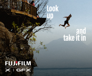
One of the most valuable things that picture editors and commercial clients will be looking for is how busy your picture is, and how well it will work with other graphical elements.
Think about a cover of a magazine - it needs to include the masthead (magazine’s name), as well as all the cover lines. Images with a minimalist aesthetic that leave plenty of room for these features tend to do well here, where they might otherwise look a bit empty in isolation.
Similarly, features and adverts will often run text over your images, which will need to stand out clearly. It’s worth bearing this in mind when on your next shoot - consider shooting different images that will work for different clients or different needs. If you can provide shots that fill the frame and work well in isolation, but at the same time, also show the same subject with more space around it, you’ll catch the eye of commissioning editors as being an all-rounder.
It’s a good idea to also include imagery that can be easily cropped depending on the needs of the editor. You can’t afford to be precious about your perfect composition if you want to sell your images.
Make it easy for images to be cropped to include / remove certain subjects, or for horizontal images to be cropped vertically, and you’ll also be rewarded for your flexibility.


Expertly crafted guides and tutorials brought to you directly from the Team Picfair.
View all articles

